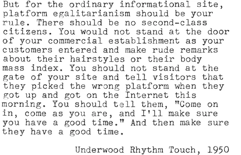


Transcribed below.
Why “Mobile First” Is the Wrong Idea
“Mobile first” is the web-design philosophy promoted by Google and latched onto by designers everywhere looking for a buzzword to buzz into the ears of clients. It makes perfect sense: we have long since passed the point where a majority of web users see the Internet on a phone screen. But it is also wrong, as sensible as it sounds.
It is not wrong because the phone screen is a worse tool for displaying a website than a computer screen is. Of course a phone screen is worse, just as a mass-market paperback book is (or perhaps we ought to say “was”) a worse format for printing text than a 6 x 9 hardcover book. But people bought and read mass-market paperbacks because they were cheap, portable, and convenient, and the same is true of smartphones.
No, “mobile first” is wrong because it implies that there is a second. It implies that you must choose one format or the other—desktop or mobile—that will give your visitors the best experience from your site, and the people stuck with the other format will have to settle for a second-rate experience.
If you are thinking that way, you should think again.
You should also think again if you are thinking the even more pernicious thought that, if there are features that naturally work better on a desktop computer, then the desktop version of your site should be hobbled so that it works no better than the mobile version. If at any time in your design career you find yourself thinking, “I’d better make this worse,” then your train of thought has derailed and leaked toxic assumptions into the ecosystem.
Instead of those thoughts, you should be thinking about platform equality. The next visitor to your site should have a good time there, and it should not matter whether the site appears on a phone screen or on a 27-inch monitor.
Obviously there are exceptions galore to this principle. There are sites that are by nature more likely to be seen on phone screens than on big monitors, and there are sites that are naturally better suited to a large screen. To pick an example at random, a typewritten or handwritten blog is hard to make perfect for every size of screen; the best one can do is keep the columns narrow enough that the text will be legible on a phone.
But for the ordinary informational site, platform egalitarianism should be your rule. There should be no second-class citizens. You would not stand at the door of your commercial establishment as your customers entered and make rude remarks about their hairstyles or their body mass index. You should not stand at the gate of your site and tell visitors that they picked the wrong platform when they got up and got on the Internet this morning. You should tell them, “Come on in, come as you are, and I’ll make sure you have a good time.” And then make sure they have a good time.

Leave a Reply