

The typewriter is a Smith Corona SL 500 with the Regency 10 printwheel that came with the machine. The printwheel was advertised in Smith Corona literature as “Regency 10/Courier 10.” The typewriter was set for automatic carriage return, which accounts for the very ragged right margin.
It appears from looking at sites here and there that many people think “Courier” means “monospaced typewriter type.” Courier is a particular typeface designed for IBM in the 1950s; the generic term for monospaced typewriter type in America is “Pica” or “Elite,” depending on the pitch. It is a tribute to Courier’s success that it nearly took over that generic meaning.
Transcribed below.
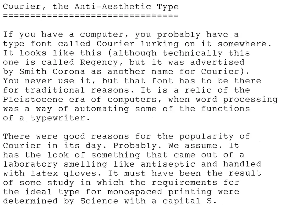
Courier, the Anti-Aesthetic Type
If you have a computer, you probably have a type font called Courier lurking on it somewhere. It looks like this (although technically this one is called Regency, but it was advertised by Smith Corona as another name for Courier). You never use it, but that font has to be there for traditional reasons. It is a relic of the Pleistocene era of computers, when word processing was a way of automating some of the functions of a typewriter.
There were good reasons for the popularity of Courier in its day. Probably. We assume. It has the look of something that came out of a laboratory smelling like antiseptic and handled with latex gloves. It must have been the result of some study in which the requirements for the ideal type for monospaced printing were determined by Science with a capital S.
Courier was the type that came with every electronic typewriter and every letter-quality printer. It was the monospaced font that was built into every laser printer when laser printers first appeared in offices. Aesthetically, it seems to have less character than any other typewriter- style type. But it was everywhere, in every kind of document, and its lack of character was probably the reason.
Words are conveyers of meaning in text, but they are not the only conveyers of meaning. The look of the text also has a message for us. The message of Courier type is that this text is to be judged by its words alone. Courier is the type style that says, “Don’t look at me. Look at the words. I’ll just get out of your way.”
Well into the present century, there were major publishers that had no way of accepting electronic submissions. They expected submissions on paper, in monospaced type, double-spaced, with one-inch margins. Meeting those requirements was the first test for the writer. Courier was the type that told the editor that here was a professional who at least understood how the game was played.
Eventually, even the last holdouts adapted to the age of word processing, and now they are likely to receive their manuscripts set in Times New Roman instead. But Courier still lurks on our computers, where it pops out at us unexpectedly in specialized uses. It is the type that says “Here is text that has not been designed.” It quotes passages of code, or reports errors, or tells us that something has gone wrong.
Dr. Boli will admit that he does not like Courier. Even with an electronic typewriter, he will find an alternate printwheel so as to be spared the sterility of long passages of text in Courier. But a style of type that took over the world for two decades has earned some grudging respect. It was a big success, and there must have been a reason for that.
Leave a Reply